First things first : Since things can become rather
chaotic when using other settings, I have made it
quite obvious that this site is best viewed with
1024 x 768 screen resolution and 16 Bit, High
Colors... Its not like I make it easy for you to
forget, huh? I also use the Arial font throughout my site,
so I highly recommend that you get it if you don't have it
already. I cannot be certain of the quality of the site
presented or any particular order if any other settings or
custom fonts are used in your browser. Keep that in
mind!
Basic operating instructions : I am an enthusiastic amateur
graphic designer and I have been known to spend more time on
a single button or header image than most people would spend
on an entire page. Thus, I tend to use WYSIWYG (What You See
Is What You Get) page designers to produce my
layouts. I prefer doing it this way at the moment
because I have more of an eye for layout and design
than scripting and implementation. If my margins are
way off or tables never seem to meet, please email me to report the bug.
This pane is a help console which offers you all the basic
information about this site and sections within it right up
front, so you don't have to mess with annoying help boxes or
little tidbits of information sprinkled throughout pages.
The pane to the right contains my news and events. This is
where I post updates and relevant events in my life. It is
turning into more of a blog than a news section so things
may have to be rearranged. I haven't decided.
The lowdown : Wondering what those nifty, formatted text
links go to? Look no further. To make sure all visitors have
no trouble navigating my site, I have listed the origin and
purpose of the major sections you will want to know about:
images - It is rare that I hang on to any digital graphics I
create. I am very picky about what looks good and I rarely
meet my own expectations it seems. However, friends and
colleagues insist that my images are indeed desktop worthy
and suggested putting up my own special place for them here.
You will find my original works and even the stuff I used
for practice with tutorials. I am beginning to delve into
animation and 3D artwork, yet most of the skill I require
still eludes me. To say the least, few of my experiments
with Lightwave, Rhino or even Flash will make it on here. I
have used Photoshop since version 4.0 and it continues to be
the program I have the greatest skill with.
writing - Before any of my experience with graphic design, I
have been a writer. I grew up with a stutter and learned to
use the written word instead of the spoken as my voice. Like
my digital work, I rarely keep anything I write for very
long as I seem to write when inspired and the piece loses
its appeal when not in the mood it was written for. Due to
the popularity of the few pieces I have distributed and
constant insisting from friends and family, you will be able
to find my writing right here.
contact - Want to drop me a line or report a bug? Click
right here.
missing - I created this section in case any of you want to
know more about the person who created all of this... me. If
for some reason you are curious about me, check this section
out for my pic, bio and even a resume (You know, just in
case).
links - This is where I provide links to my favorite web
sites. Very much an expression of myself, you will find
links to sites with regard to causes, information, science,
poetry, philosophy and utility. Check it out.
friends - Self-explanatory. Go here to check out the
websites of some of my partners in crime.
about - Random information about my site, my software, tools
and projects. |
 |
The Great Divide: Linux and GUI
Posted on 3:44am, Tue Jun 24
When I heard the announcment that the new
version of Internet Explorer
will not allow updates since the development of the technology has
ground
to a halt, I decided it was high time to get something else. My logical
choice was open-source and thus I met Mozilla. When working with
Frontpage on this site, I found that it would garble my source and
insert
jibberish wherever I had put an underscore like in an image filename.
After noticing that Mozilla includes Composer, I immediately switched
the
site over to it. From what I can see, there are no issues other than a
differance in interface with tables. Movin' on up......
-Mg
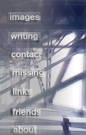
Interfaces with.... flair?
Posted
on 5:14am, Sun Jun 22
Today I played around with tutorials for creating buttons
and interfaces. I spent about an hour and a half
working through several ideas but none of them
looked quite right. I decided to just give it a shot
and try to make something that fit with the rest of
the motif. Within five minutes I had the design you
now see to the right. I figured the original work
would probably fit in a lot easier than using a
template. I was right. I am hoping this design will
stick and the pixilated text blur isn't too much
overkill for one page. Send me your thoughts.
-Mg
Minor Puzzles...
Posted
on 2:37am, Sat Jun 21
I am more than dissatisfied with the site links on
the right. I want something besides simple text. I
despise underlined text with a passion, so I must
come up with an idea to replace it. I am rapidly
coming to the decision that creating a vertical
button column is the only way to go. I would like to
use transparencies to get some nifty edges on the
buttons... and some textures.
-Mg
Site Layout: Proceeding in
ice ages?
Posted
on 4:24am, Mon Jun 20
It would seem as though I
am making progress on the site, yet there
is still much left to do. I have spent most of the
night and parts of the morning making banners and
welcome screens, trying to come up with something
satisfactory. I rather like the page title image I
came up with. It is simple and somewhat stylish with
the combination of background and text effects. I
picked up the text effect from a tutorial, I forget
where. The background, I managed to come up with
myself. I duplicated the picture, hit Radial Blur
set to zoom at 35, selected Overlay as layerstyle
and set the clean background to about 75% opacity.
Then used elliptical marquee to feather and blur the
edges.
The time consuming parts are always the little
things like making margins tighter, coordinating
cell shades across tables and configuring text to
fit in them. I am having trouble finding friends
links and link buttons to go with them. Please help
me out, if you can!
-Mg
|
|